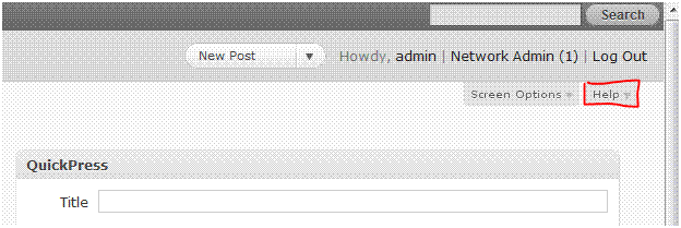
The WordPress help tabs rely on educated bets about what people will need at a quick glance, and where they will need it.
To see this, look at the two admin screens where a new or newish user is most likely to use the contextual help for the first time. (Of course this is my personal guess; the other people who worked on the tabs could have other opinions…) These two tabs are also the ones most in danger of being too long or too dense.
The Dashboard screen appears when one first logs in; it’s like the home page for the Admin. The screen itself just contains seven boxes. But because it’s really the primary screen, we took the opportunity to mention many introductory things. We clued in people to the existence of helpful tips on each screen. We explained how the left-hand navigation menu works as well as the new Admin Bar above the Admin Header. I put in “new in 3.1” to reassure people of the fact that this content is being kept up to date.
The word “Box” replaced “Module” from 3.0 for the sake of brevity as well as polling well. “Faint separator lines” between named sections replaced “the separator lines between navigation sections that end in double arrowheads” because those lines were too faint to make out where the double arrowheads were. Also, between “Dashboard & Posts”/”Comments & Appearance” is clearer by being more specific than “navigation sections.”
New Post is the other screen where people will go frequently and first look for and at help. Using the “Screen Options tab to unhide more boxes” is a new phrasing because most of the boxes on this screen are now hidden by default. “Post Formats” is also new but this paragraph only appears in the tab if one’s theme enables this feature. The pointer to the full screen editor button in Visual mode is a new mention of an old (TinyMCE) feature that many people aren’t yet aware of when asking for an expansion of the writing box.
Of course, one can also expand that editor box by dragging the lower right corner of it, and its default size is slightly bigger because many of the other boxes are hidden by default. Just wasn’t room to add all that!
Here are screenshots of Dashboard and New Post help tabs. I’m figuring out how to best frame and display samples of these with custom post types, using the Custom Post Type UI plugin.


